Chart Presentation
Select the “Chart” radio button on the “Display Query Results” dialog if you want the results of the query to be presented as a chart. The chart will display the value of a certain attribute of the business object the query is looking for on the X-axis and the value of another attribute on the Y-axis. Thus, instances of the business object returned by the query will supply data for the chart. The following options are available when displaying the query results as a chart:
Width/Height
Width and height of the chart in pixels
Stretch to the bottom of the screen
If this is ticked the height of the chart will be automatically calculated to occupy the entire screen
Show chart title
If this option is ticked the title of the chart will be displayed at the top or bottom of the chart. You can also select the font with which the title will be displayed.
Chart Type
Select the type of the chart:
- Standard
- Pie
- Donut
- Radar
- Bubble
- Scatter
- Funnel
Standard chart
The “Standard” chart includes the following types:
- Bar
- Line
- Area
- Range Bar
- Range Area
- Bullet
The difference between the Standard and other types is that for any Standard chart you can combine it with another Standard charts and display series. Other chart types either do not support series at all or can be combined withh the same chart type only (like donut charts). The picture below shows a chart with two series – one bar and one line:
When you select the Standard chart you have to define the attribute shown on the X axis and then define one or more series displayed on the chart. For each series you have to select the type of the chart displayed for the series and then define the attribute that will be shown on the Y axis for this series. You can also specify the color of the series here.
You can can add and delete series by clicking the Add and Delete button. Clicking on the Edit button allows you to specify additional options for the selected series:
- Invisibility condition – a condition when the series is not displayed. You can use tag expressions that refer to the object shown by the chart
- Label – whether or not labels will be displayed for the series and where. Labels display Y values shown by the chart. On the picture above the green bar series includes labels shown “inside” the bars
- Stacked bars – if this is ticked bars are stacked on top of each other (see below)
- Flip X and Y axis- if ticked X and Y axis are flipped as on the stacked bars picture above
- Opacity – opacity of the series as a number between 0 and 1
- Gap – distance between bars of the same series as percentage of the bar width
- Spacing – distance between bars of the different series as percentage of the bar width
- Display format – a format with which numbers of the Y axis are displayed. This allows you to override the number format defined for the attribute itself.
- Aggregate function AwareIM can aggregate different Y values for the same X value. For example, if a chart shows sales records for different people, AwareIM can aggregate all sales values for the same person and display just an aggregate value on the chart. In addition, if X-axis of the series represents a date, AwareIM can automatically aggregate values even if dates are different. Whether two different dates are considered the same depends on the value of the “Base Unit” specified for the X axis. For example, if the value is MONTHS, then all dates belonging to the same month of the same year are considered equal and are aggregated.. The aggregation feature often frees up developer from performing aggregate calculations using rules (and possibly storing the results in some intermediate object to be shown on the chart instead of the original object)
- Show markers, dashed and smooth line, line width – various self explanatory options of the Line or Area series
- For Range Bar and Range Area charts you also need to specify attributes that hold the value of the range start and range end (see the picture below for an example of the range bar chart. There is also An example of the range chart is in the Sales Portal sample application (Graphs tab).
- For bullet charts you need to specify the attributes that hold the “current” and the “target values. You can also define colors of the current and target values and specify orientation. An example of the bullet chart is in the Sales Portal sample application (Graphs tab).
note
Note that it is possible to display additional series on the chart using the criteria defined by an additional attribute. Consider a scenario when you have to display product sales per month. The X axis displays a month and Y axis – total number of sales for the month. However, you also want to display sales per product where each product is represented by its own series. In this case you will define one series with Y attribute representing sales quantity and you will also select the “additional” attribute – a reference to the product as an “alternative” method for defining series.
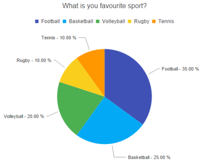
Pie chart
This chart type represents pie charts (shown below). You cannot define series for this chart type, but you can define colors of the pie, as well as properties of the labels:
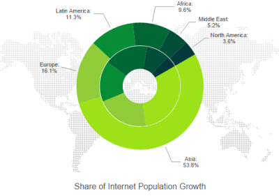
Donut chart
The donut chart is shown below. You can define series for this chart type. Each series represents a ring of the donut.
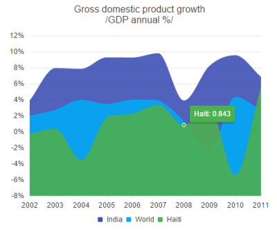
Area chart
The area chart is shown below. You can define series for this chart type. Each series represents filled area on the chart.
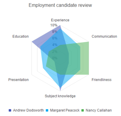
Radar chart
The radar chart is shown below. You can define series for this chart type. Each series represents an area on the radar
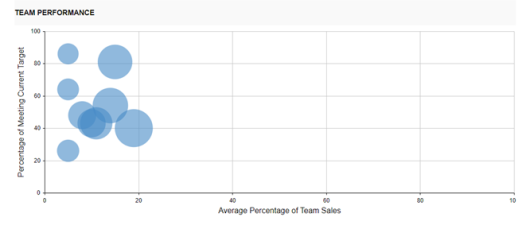
Bubble chart
This chart can be used when there are 4 parameters that describe an item location on the chart - the category, X value, Y value and the 3rd parameter is represented by the size of the circle (see the picture below). An example of the Bubble chart is in the Sales Portal sample application (the Graphs tab)
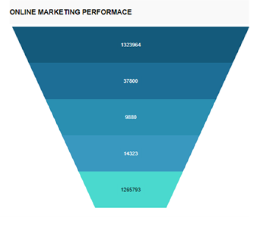
Funnel chart
Funnel charts are a bit similar to pie charts. To configure such a chart you need to define the category attribute and the value attribute (see the picture below). An example of the Funnel chart is in the Sales Portal sample application (the Graphs tab)
Scatter chart
This chart is very similar to the Line chart, however, the X axis of the Line chart shows a category, whereas the X axis of the Scatter chart shows coordinate value.
An example of the range chart, bullet chart, funnel chart and Bubble chart
Axis Properties
You can specify the following properties of the X and Y axis:
Title
Title of the axis displayed near the axis
Format
If the axis displays dates or numbers you can specify how the values will be formatted. By default values will be displayed using the format specified in the attribute that the axis shows
Min. Value / Max. Value
By default AwareIM will automatically determine min. and max. values that the axis will show based on the available records. However, you can override the default behaviour. For example, if you want the axis to always start with 0 irrespective of the values shown you can specify 0 as min. value for the axis.
Number of ticks
By default this number is determined automatically but you can override the default and provide your own value.
Base unit for dates
This value is related to the aggregate calculations for dates explained in the properties of series section. It determines which dates will be considered “equal” for the purpose of aggregation. For example, if you select “weeks” then values for all dates in the same week will be aggregated
Color Ranges
You can specify different colors to be displayed for different value ranges of the X or Y axes. See the picture below:
Additional Axes
You can define additional Y axes with different colors and properties as shown on the picture below (from the CRM sample application. The most important proerty is the “X crossing value”. This value defines where the Y axis will cross the X axis. If you specify 0, the axis next to each other at the 0 crossing point. But if you want the axis to be at the far end of the X axis then this point is not possible to describe using coordinates, because the X axis shows categories, for example months. There are 12 months in total, so you can specify any value larger than 12.
Legend
If you select this property the chart will show the “legend” describing each series at the specified position on the chart – for example, in the radar chart above the legend is displayed at the bottom of the chart.
Tip
Tick this option if you want AwareIM to display a tip when the user hovers the mouse over the value on the chart. You can select the format of the display:
{SeriesName} refers to the name of the current series;
{YValue}, {XValue} refer to the current values.
Other Settings Dialog
The following properties can be specified if you click on the Other Settings button:
Inset Padding
Padding that will be added to the chart area
Background Color, Backgound Image,
Select these options to specify background colo or image of the chart
Border Color
You can specify a color of the border around the chart area
Opacity
Opacity of the chart area as the number between 0 and 1.
Pan and Zoom support
If this option is ticked the chart will support panning and zooming.
Chart ID
You can assign any value as the chart id. You can then use this value in the SAVE SCREEN action if you want to capture the chart in a file or in a PDF document.
Filters
See this section: Query Filters
Video Tutorials
Please also watch the following video tutorials about charts:
Configuring charts in AwareIM.
This video tutorial describes new features in Charts:
- Bullet Charts
- Bubble Charts
- Range Charts
- Funnel Charts
- Multiple Axis
- Color Ranges
- Circular and Arc Gauges
Gantt Presentation
Select the “Gantt” radio button if you want the results of the query to be presented as Gantt chart. This option is only enabled if the query looks for objects that are members of the GanttTask group (the group is created automatically when you add support for Gantt objects into your application). See the “How to add Gantt chart to your application” article in the How To Guide for more details.
Configuring Gantt charts in AwareIM.
Kanban Boards
A query can be used to display Kanban Boards in AwareIM. A picture of a Kanban board from the Issue Resolution sample application is presented below:
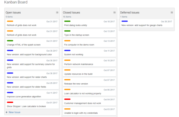
Here a query that retrieves all issues in the system as shown as 3 Kanban columns – open issues, closed issues and deferred issues (Status attribute of the Issue object has the value of Open, Closed and Deferred respectively). The user can move an issue from one column to the other, thus changing its status
This video tutorial explain how to work with queries to create Kanban Boards